Comments about art style for the game in early development.
Main goals - fix inconsistencies, and then add depth and interest staying within the style. Fixing inconsistencies - two basics for now.
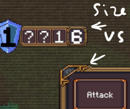
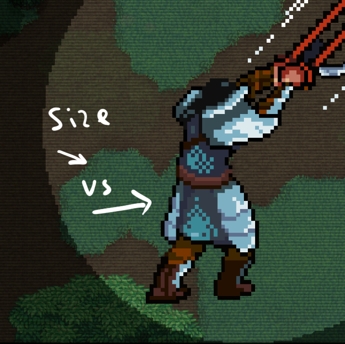
-Resolution - One of the main issues with modern pixel art style - usage of pixels of different sizes. Because we are not physically limited with screen size, but only mimicking that. You have that and fixing it will improve the coherence.
In some places it has possibly been done in exaggeration to show the importance of the moment, but it will only work if everywhere else it will be fixed. Also it’s shown in a fonts, but it’s a separate topic.
-Fonts/UI - You use pixelated fond in a lot of places. I also like that when you need to use it in a bigger size you draw it bigger. But there are dialogs texts and “Skip cut scene”. It could easily be exchanged with pixel art style font.
Add more interest and details.
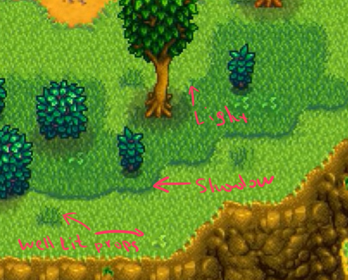
When we see a game screen I can totally see how distinguished characters are from the background. Which is a good thing. But I also like to look at the whole screen. And the majority of the screen now is one tile of grass\rock\tiles. Which is not only monotonous, but slightly breaking the illusion of perspective and lighting. What I could suggest:
-Lighting on borders - add lighting on borders in between tiles - grass\dirt, stone\stairs.
-Add tiny scatter objects - lighting on them should be very correct - they are to brake monotonous and keep us remember about what perspective we are looking at - tiny rock, grass patches, dust piles, broken tiles, etc.